|
A. Abstract vs. Non-Objective Abstract art begins with a subject from reality, whereas Non-Objective art includes no visual reference to reality. Although, they are different, it can be difficult to draw the line between the two. Sometimes it can help to look at the piece and see if you, the viewer, sees any things that resemble objects or figures from the real world. Here is what I believe to be abstract art: 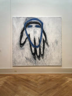 Blue Head Susan Rothenberg 1980-81 Acrylic and vinyl-based paint on canvas I think that this piece is abstract because, although it the outlines resemble a hand and head, they are abstracted, meaning there are altered away from reality. Here is what I believe to be non-objective art: 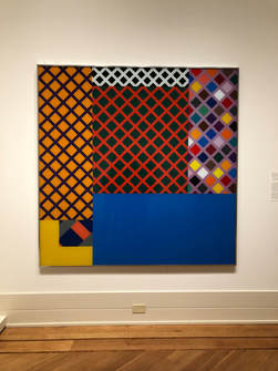 Untitled (yellow corner) Richard Roth 1971 Enamel paint on glass I think that this piece qualifies and non-objective because it does not directly reference or resemble any objects or figures from the real world. B. Abstract Expressionism Before I had always thought that abstract expressionism was just abstract art that was very distant from rendering a realistic form. After research, I know that Abstract Expressionism developed from abstraction in New York, in the 1940s and 1950s. It focuses on expressing emotions and the creative spontaneous act. Here is an example of what I believe to be Abstract expressionism: 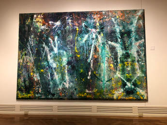 Born Again Sam Gilliam 1968 Magna and acrylic with aluminum powder on canvas I think this qualifies because it is definitely abstract, and conveys spontaneity and lots of movement. C. Mark-making 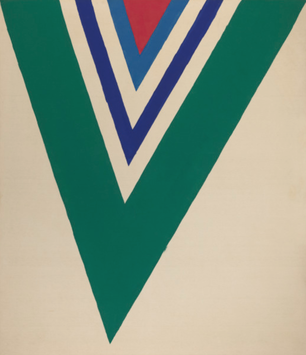 17th Stage Kenneth Noland 1964 Acrylic on canvas It seems like the marks in this piece were extremely careful, deliberate, and slow. The lines are very straight which surely took lots of concentration, unless something like tape was used. 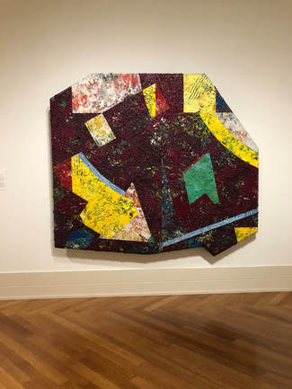 Chasers: Purpled Sam Gilliam 1980 Acrylic on Canvas It seems like the marks made to create the texture of this piece were done very quickly and in a somewhat random manner. It seems like the texture was created with a serrated tool and all of the marks are going different directions, covering the piece.  Jungle Jim Lieberman Nicholas Krushenick 1969 Acrylic on canvas The marks in this piece are very repetitive, and seem very precise and deliberate. I would think the lines were drawn/painted using a ruler or some other tool. Depending on the tool used, the marks could have been made quickly or slowly, it just depends. D. Using art to answer questions about the artist 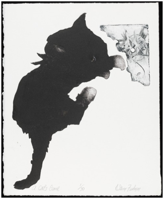 A Cat's Game Steven Fishman 21st century etching and aquatint (?) on wove paper Fishman used lots of contrast, color, value, and shape in this piece. The cat takes up a large amount of the piece and then there is a little drawing in the corner, putting emphasis on the large cat. It seems like the shape of the act may have originally been unintentional, like a spot made with ink. Maybe after this was done, the cat shape was enhanced and then emphasized with the little drawing (as contrast). This makes the artists eye look at the simple cat and then move to the detailed, small drawing. 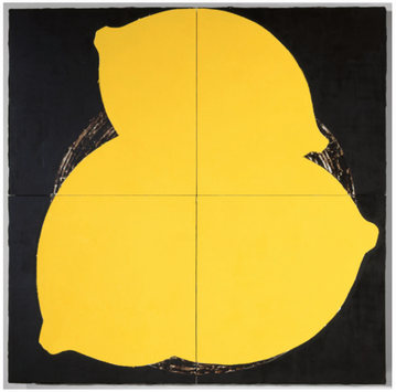 Lemons May 16 1984 Donald Sultan 1984 latex paint, plaster, butyl rubber, on vinyl tile over masonite In this piece, Sultan uses color, contrast, shape, and emphasis. I think that he started out with the black background and then added the lemons with the yellow latex paint. There is lots of contrast in the piece, possibly representing a meaning he was trying to convey. The color choices were clearly very intentional. Since the painting is so large, along with the lemons (the focal point), your eye is forced to look at the smaller details in between the lemons (in the background). 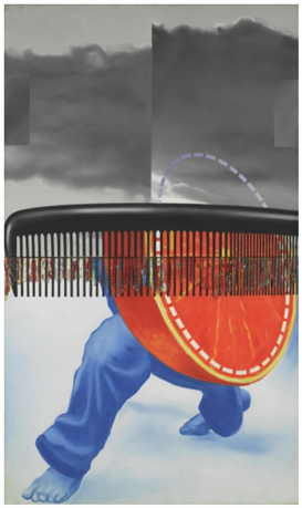 Early in the Morning James Rosenquist 1963 oil on canvas, plastic This piece shows the use of color, contrast, shape, and some overlay. It seems like he started by painting the background, then the paints and orange, and then the comb - this is just a guess. The color choices may have just been used for accuracy or to represent the differences between the objects. I think some of the choices made were just to add visual interest. The bright colors draw in the viewers eye, and then it is natural for viewer to next focus on the background and some of the less noticeable details. The composition of the piece is very interesting, the weight of the photo is mainly in the bottom half - this could be done to make the viewer's eye move up the piece.
2 Comments
Natalie
11/28/2018 11:24:57 am
Ada I LOVE this!! You went really in depth with the background info on Pindell and the bio gave a great overview into how her life altered her art. You also did a really good job with going into the artists' minds for part D of the abstract art assignment and I could almost see the artist in their lil studio creating the art. I also found it kind of funny how we chose some of the same works and said very similar, if not the same, things about them. One small thing is that there were a few typos/grammatical stuff to fix but the content and everything you said was amazing!
MM
11/29/2018 10:44:30 am
YES! Great work! I love that you now know more about the DIFFERENT kinds of abstraction and that AbEx is a specific movement, born of a specific time/place. Your observation and analysis of the varied works of art is stellar! Leave a Reply. |
Archives
June 2021
Categories |
 RSS Feed
