|
A. Abstract vs. Non-Objective Abstract art begins with a subject from reality, whereas Non-Objective art includes no visual reference to reality. Although, they are different, it can be difficult to draw the line between the two. Sometimes it can help to look at the piece and see if you, the viewer, sees any things that resemble objects or figures from the real world. Here is what I believe to be abstract art: 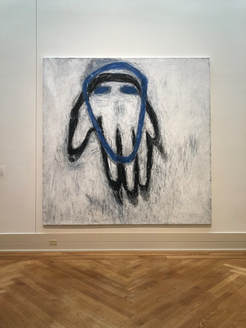 Blue Head Susan Rothenberg 1980-81 Acrylic and vinyl-based paint on canvas I think that this piece is abstract because, although it the outlines resemble a hand and head, they are abstracted, meaning there are altered away from reality. Here is what I believe to be non-objective art:  Untitled (yellow corner) Richard Roth 1971 Enamel paint on glass I think that this piece qualifies and non-objective because it does not directly reference or resemble any objects or figures from the real world. B. Abstract Expressionism Before I had always thought that abstract expressionism was just abstract art that was very distant from rendering a realistic form. After research, I know that Abstract Expressionism developed from abstraction in New York, in the 1940s and 1950s. It focuses on expressing emotions and the creative spontaneous act. Here is an example of what I believe to be Abstract expressionism: 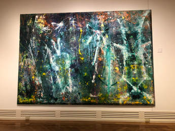 Born Again Sam Gilliam 1968 Magna and acrylic with aluminum powder on canvas I think this qualifies because it is definitely abstract, and conveys spontaneity and lots of movement. C. Mark-making  17th Stage Kenneth Noland 1964 Acrylic on canvas It seems like the marks in this piece were extremely careful, deliberate, and slow. The lines are very straight which surely took lots of concentration, unless something like tape was used. 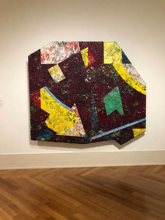 Chasers: Purpled Sam Gilliam 1980 Acrylic on Canvas It seems like the marks made to create the texture of this piece were done very quickly and in a somewhat random manner. It seems like the texture was created with a serrated tool and all of the marks are going different directions, covering the piece.  Jungle Jim Lieberman Nicholas Krushenick 1969 Acrylic on canvas The marks in this piece are very repetitive, and seem very precise and deliberate. I would think the lines were drawn/painted using a ruler or some other tool. Depending on the tool used, the marks could have been made quickly or slowly, it just depends. D. Using art to answer questions about the artist 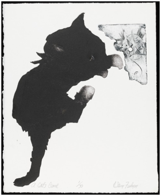 A Cat's Game Steven Fishman 21st century etching and aquatint (?) on wove paper Fishman used lots of contrast, color, value, and shape in this piece. The cat takes up a large amount of the piece and then there is a little drawing in the corner, putting emphasis on the large cat. It seems like the shape of the act may have originally been unintentional, like a spot made with ink. Maybe after this was done, the cat shape was enhanced and then emphasized with the little drawing (as contrast). This makes the artists eye look at the simple cat and then move to the detailed, small drawing. 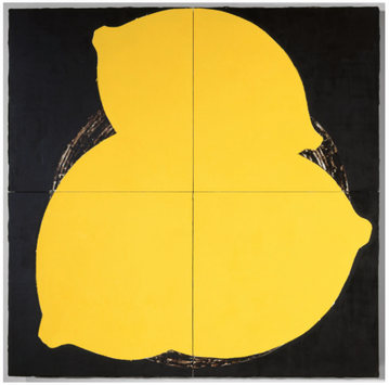 Lemons May 16 1984 Donald Sultan 1984 latex paint, plaster, butyl rubber, on vinyl tile over masonite In this piece, Sultan uses color, contrast, shape, and emphasis. I think that he started out with the black background and then added the lemons with the yellow latex paint. There is lots of contrast in the piece, possibly representing a meaning he was trying to convey. The color choices were clearly very intentional. Since the painting is so large, along with the lemons (the focal point), your eye is forced to look at the smaller details in between the lemons (in the background). 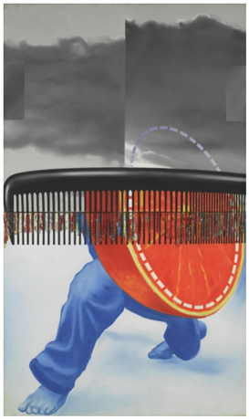 Early in the Morning James Rosenquist 1963 oil on canvas, plastic This piece shows the use of color, contrast, shape, and some overlay. It seems like he started by painting the background, then the paints and orange, and then the comb - this is just a guess. The color choices may have just been used for accuracy or to represent the differences between the objects. I think some of the choices made were just to add visual interest. The bright colors draw in the viewers eye, and then it is natural for viewer to next focus on the background and some of the less noticeable details. The composition of the piece is very interesting, the weight of the photo is mainly in the bottom half - this could be done to make the viewer's eye move up the piece.
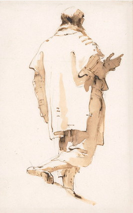
2 Comments
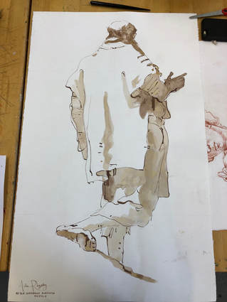
I absolutely adored this exhibit. I thought all of the work was visually beautiful and had powerful meaning behind it. (Some of it was also very aesthetically pleasing and satisfying, which is definitely something I am drawn to and like.) To start out, the exhibit had a video about Pindell's art and events throughout her life. I found this very helpful and as something I could always think back and relate to when looking at the art. Throughout the exhibit, wall text talked about the different aspects of Pindell's life and her as a person. These included information on her being a memoirist, traveler, activist, and scientist. I found it so interesting how evident the relationship between these traits and her work was. Some of my favorite art in the exhibit was her 3-dimensional pieces with the hole punches, her work post-accident that included some aspects of self-portraits and had lots of meaning behind it, and the astronomy related pieces. Mentioning all of the post accident pieces leads me to actually talking about the accident and its effects. I thought it was so so fascinating how her head injury and recovery translated into her work, like how she would try to jog her memory or focus on very meticulous tasks. Through all of Pindell's art she has taught me and many viewers how to express ideas and messages with art and how to experiment with different styles and materials. A few artist habits of mind she and her art clearly exhibited were 'develop craft', 'engage and persist', 'express', and 'observe'. I also see how her work demonstrates the steps included in AIII.4, particularly with inspiration (like form travel, issues, and things in the media). It was very nice how the work in the exhibit was shown in somewhat chronological order because it made it easier to see how events in her life affected her art and how she grew as an artist and person. Artists, their work, their techniques and materials, and their styles really do change. One way I can kind of relate to this change of an artist is with my sketchbook. Our sketchbooks show how we, as young artists, and our work progress. Overall, I feel like I really got a lot from this exhibit. I hope to continue to learn more about Howardena Pindell and to use her art as an inspiration. Here are a few of the pieces I particularly liked: 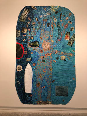 Autobiography:Water (Ancestors/Middle Passage/Family Ghosts) 1988 acrylic and mixed media on canvas Wadsworth Atheneum Museum of Art, The Ella Gallup Sumner and Mary Catlin Sumner Collection Fund 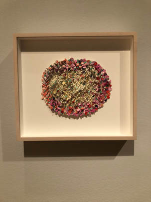 Untitled #49 2010 Mixed media on board Spelman College Museum of Fine Art Over the past few weeks I have been working on the Old Masters Project, copying Walking Man, before 1762, by Giovanni Battista Tiepolo. I started by getting down the basic lines of the piece using grid lines. I think this step was fairly successful. Next, I added the ink wash. This was the step I struggled with the most. It was very hard for me to get an even wash, while also trying to accurately place the wash. I also had an issue with the wash turning yellow, but by the end of the project this really didn't bother me much. The final step was adding the lines, the marks. I do not think this part was too much of an issue for me, however, during this phase I misplaced a few of the lines, slightly throwing off the accuracy of the whole piece. I also think at times I wasn't really implementing Tiepolo's application technique because I was so focused on making the lines appear accurate. Overall, I am happy with the outcome of this project because of the accuracy of my replication and having had the opportunity to learn from some of my mistakes throughout the process. Technically, my project is not altogether complete because I decided not to add any of the charcoal marks and still have not erased the original pencil lines. Below are pictures of my piece throughout different phases of the project: Here is my (somewhat) final piece next to Tiepolo's original Walking Man, before 1762:
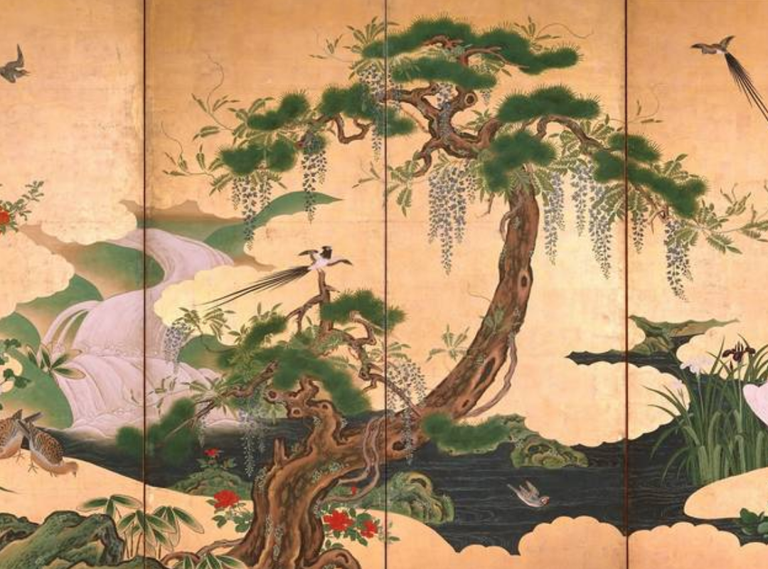
Experience: Lunchtime Lecture on Japanese Aesthetics with Amanda Dalla Villa Adams (10/31/18)11/6/2018 Reflection: I learned so much from Amanda Dalla Villa Adams through her lunchtime lecture on Japanese Aesthetics. To start, she mainly talked about the history of the aesthetics and how they spread. I actually already knew some of this information from lessons and readings in my global studies class this year. However, I had never learned or thought about this information while mainly focusing on the art aspects. It was very nice to kind of see the information in a new light. Next, she talked about Wabi, Sabi, Yugen, and a little on No Aware. Previously, I had very little knowledge regarding these topics. I did know a little bit from the lunchtime lecture last year, but that mainly focused on a specific artist's work and mindset. This website includes a substantial amount of information on Japanese Aesthetics, including basics on Wabi, Sabi, Yugen, and No Aware: Later, she showed us and talked about specific works of art, mainly in the VMFA's collection. These were so cool to see! Just seeing these few pieces inspired me to start looking out for similar styles, and maybe even these specific pieces, at galleries and museums. I now also want to look more into how to apply this new knowledge and information to my art and perhaps assignments in history. This lecture also led me to think about a few questions;
Below are a few examples of art implementing the ideas behind Japanese Aesthetics: |
Archives
June 2021
Categories |
 RSS Feed
