 Today - April 30, 2021 -Dr. Nicewinter, an art historian, spoke with us about Inka Art and Architecture. She began by explaining the spelling of Inka, which I found very interesting. Basically, it is very difficult to translate from Quechua (the language of the Inkas) to English, and that actually, Inka technically means king. Dr. Nicewinter then went on to discuss more about the actually history, culture, and art of the Inkas.
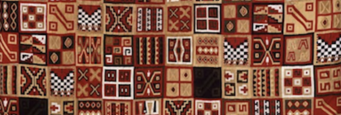
Within early Inka culture, there was no wheel, writing system, marketplace, or breasts of burden. Because of the mountainous terrain and lack of animals able to pull carts, wheels really wouldn't have had a significant use. In regards to the lack of a marketplace, there was more of an emphasis on the more free exchange of goods and ideas. The land of the Inkas varied both greatly and quickly - marked by quick transitions between dry coastal desert, highlands, and the Amazon Basin. Out of these transitions arose stark differences in resources within the bigger culture, which led to adaptation and the bringing together of differences. The idea of verticality was prominent, meaning that "cross environment interaction took place to obtain necessary food and materials." Basically, people from different latitudes had to work together, despite their varying environments. This actually is a portion of what contributed to the spread of differing art styles. Inka is also referred to, almost more accurately, as Tawantinsuyu, meaning four parts. These four parts are Chinchasuyu, in the NW, Antisuyu in the NE, Qontisuyu in the SW, and Qullasuyu in the SE. Textiles have been deems one of the most important art forms within Inka culture. Basically, weaving was seen as the fabric of the universe. Individual textiles were even thought to be microcosms of the society as a whole. They were never cut, just woven to shape, featured many repeating geometric shapes, and used as markers of identity and status. Cama, in Inka culture, refers to a kind of essence, force, or power. Although there is no known name for artists in the society, many of the weavers were referred to as Camayaks - people who bring the camay. This shows their importance and status within society, in at least a spiritual sense. The idea of Ayni, which deals with two things coming together as a whole and duality, is also key to the culture. Most things within the society were actually even made in pairs become of this, connecting to the emphasis on reciprocity throughout the Inka lifestyle and tradition. Inka architecture was complex, yet very practical. Because of the severity and frequency of earthquakes in the area, the Inkas were forced to adapt. They used dry masonry, curved walls, plain roofs, and even trapezoidal doorways. Overall, I thoroughly enjoyed this lecture. I feel like I actually learned so much within a short time period from Dr. Nicewinter. One thing that particularly stood out to me was the idea of chaos vs. order within the culture - an idea I explore in my artwork. I really like how this contrast played into the idea of duality, which in the eye of the Inkas, had to do more with connection that opposition or contrast really. Perhaps next I focus more on duality - something I honestly think I have been subconsciously experimenting with in my art more recently.
0 Comments
 I really enjoyed this lunchtime lecture, as well as having the opportunity to talk to Ms. Adams a little bit even prior to the event. I felt that she covered so much information, but at the same time was really thorough - which I greatly appreciated.
A lot of the information she covered was pretty familiar to me as I had heard a very similar lecture a few years ago, but this time served as a great review and reminder. Ms. Adams first talked about both the early influences of the west on the east, that of the east on the west, how Japanese Aesthetics came to be, and what aesthetics really are: beauty and the appreciation of beauty. She also touched on how easily and often eastern culture was misinterpreted. The focus of the lecture then turned more specifically to the concepts of Wabi, Sabi, and Yugen. The idea of Wabi is derived from Shinto ideals and embraces disappointment, poverty, and imperfection - both visually and of life itself. Sabi relates more to sensitivity, and often deals with sadness or melancholy. Lastly, Yugen, which actually originated within Buddhism and came to Japan around the 6th century, deals with mystery, depth, spirituality, and a higher realm. Apart from these three main ideas, Ms. Adams also mentioned a few other prevalent concepts in Japanese Aesthetics. These included but were not limited to the importance and praise of shadows, the role of rice, qualities of food containers, relationship between mystery and darkness, the role of literature, theatre and its evolution, and temple architecture. Overall, I am very grateful I had the opportunity to attend this lecture. I feel like I learned a lot and will be able to use this information as a great resource in the future. I always find myself feeling so inspired after learning about art history and various types of art, and this has proven to be true in this case as well. Overall, I found this lunchtime lecture to be very interesting. I came into it with almost no knowledge of Fabergé Eggs and their history in Russia. I have seen various eggs in the VMFA, and have appreciated them for their beauty and attention to detail, but have never really thought about how they were created or where the came from.
To start the lecture, the speaker mentioned her own background, as she studied Russian history as well as fine arts. Now she works for the VMFA. She then touched on the magnificence of the eggs, but quickly went into aspects of Russian history. I truly knew nothing about any of this history so it was very enlightening. She specifically talked about the original families with the eggs, Stalin and politics at the time, the Tsar, the royal family and Fabergé himself. I was particularly drawn to the story of Fabergé who started a jewelry line based on archaeological artifacts and was able to make simple things beautiful. She then focused on the fiscal worth of these eggs, which was unbelievable. She compared the original prices to what they are evaluated at now which is around $33 million. I also found the story about the lost eggs very entertaining. In conclusion, I learned a lot from this lecture and it really sparked my interest in these eggs. Now, when I see them at the VMFA, I will have an even greater appreciation. On December 18th, six former Maggie Walker students, either attending or having graduated from an art school, came in to talk about their experiences. Personally, I found what they had to say extremely helpful and also quite inspiring, which I had not been necessarily anticipating. To start off, the students went around an introduced themselves. It was nice to see some familiar faces, like Lily May and Eli, as well as Alex who had joined us for her own lunchtime lecture last year. The majority of them were either currently at VCU or had already graduated from there. I was particularly interested in what they had to say, as VCU as a whole is a school I have been interested in. Although I know many people that have either gone to or are currently going to VCU, I do not know many details so I made sure to take note of what they said. What I got from their answers to the guiding questions was that
To talk a little about schools other than VCU, Lily May discussed her first year so far at MICA, and how she has been really happy with her decision to go there. She mentioned that it has definitely been a little difficult, but that this has fostered growth. She also touched on the opportunity to take advanced classes as a freshman, which I really appreciate. Lastly, Bailey discussed his experience in the UVA architecture school and how that has really fostered his need for both a creative outlook and structure. They then shortly touched on some issues they have seen or experienced at their schools, which I wouldn't have thought to ask but found as a very helpful question. They all seemed to just have experienced some annoyance with other students, but I feel like this is really inevitable anywhere you go, and they acknowledged this. Overall, I found this symposium very informative. I have never really considered going to an art school, or at least focusing on art in college, but it was still a very helpful talk. It's always nice to hear about different people's personal experiences with applying and attending college, and the more you know going into it the better, 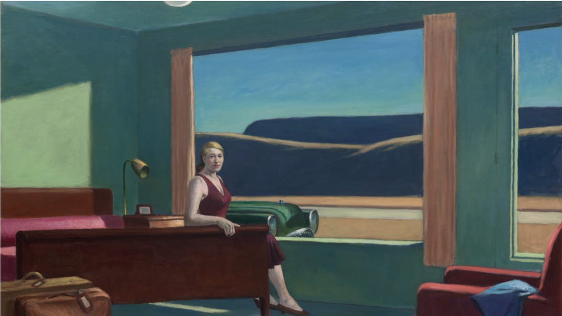 This past weekend I went to see the Edward Hopper and the American Hotel exhibition at the VMFA with my uncles, who really love art. I thoroughly enjoyed the exhibition but was honestly kind of surprised by it. Beforehand, I didn't know that the exhibition included more than just Hopper's work, what I had been expecting. All I knew about the exhibition was what I got from a quick look at an article in the newspaper. I had seen a picture of the real life set up of the painting above, Western Motel. I thought this was such a cool exhibit idea when I saw the picture, and was even more fascinated by it when I saw it real life. The real-life set up made the corresponding painting come to life. Also, since I was very familiar with Western Motel and the kind of tone I got from it, when I saw the set up it was kind of like the same feeling that I had seen in the feelings came over me. All of Hopper's pieces really interested me, as I just have so many questions. While looking at his pieces, I was continuously drawn to all the vertical lines within his composition. It wasn't that I didn't like this element, I just wonder the meaning behind it. I was also fascinated by the simplicity of the paintings, with a very complicated underlying tone. It's clear that there is deep content within and behind these paintings. I am not going to say that I in anyway fully understand this content, but the context provided by the other works in the exhibit, not by Hopper, really gave me a better grasp on it. All the other pieces related to hotels and motels and the history of them and what they can represent, supported and accompanied Hopper's pieces really nicely. Even though I hadn't been expecting this, the other works were much appreciated. Overall, I really enjoyed this exhibit, as I feel like I learned a lot about Hopper but also learned some history. I hope to learn more about Hopper in the future and get closer to answering some of the questions I have, such as
-is there meaning behind all of the vertical lines, not related to composition? -what really is the true meaning behind his work? -why did he stick with the subjects of hotels and motels for so much of his career?  Unfortunately, I was not able to attend this lunchtime lecture, but it sounded so cool. John Freyer, who has now been sober for numerous years, talked about some of his social practice art. A few examples being Free Ice Water, Free Hot Coffee, and Free Supper. These are all all apart of 50/50. From what I understand, Freyer's goal is to lessen the stigma around drug addicts and their sobriety through these social practice arts. To accomplish this. he works with a lot of youth, mainly through a VCU recovery program. All of this sounds so cool and really meaningful. I think the idea behind his work is so important, and his art is actually making a difference. To be completely honest, I did not really know much about social practice art before learning about John Freyer, but this has really opened my eyes to a whole other area of art. Since I was not able to attend this lecture, I hope to continue researching Freyer and other social practice art to learn more.
I have to say, this was probably one of my favorite field trips our class has taken. I loved all of the pieces, but also had the opportunity to learn a great deal about the gallery as a whole, the artists, and the individual pieces. Since the collection is private, we had the privilege of having the gallery to our self and having someone there with knowledge about each individual piece. I really feel like I got more out of this experience than I usually do at museums etc. We did not have the time to look at each piece (the collection was huge), but still got to see a great deal of it. A few of my favorite artists we looked at were the Philadelphia Wireman and Sonya Clark, both because of their story, content, and aesthetics. Here are a few of the works we had the opportunity to take a closer look at.  Sasha Waters Fryer studied and focused photography and documentary traditions, along with non-fiction films. Soon after all of her schooling, she began working in documentary film. During the later part of this schooling she was part of a large and lengthy project, Razing Appalachia". She would say that her education came "full circle". She was and is able to incorporate certain things she learned at not always expected times and phases of her life. She had previously wanted to focus on other's stories , which led her from documentary photography to documentary film. She currently teaches at VCU but continues with many outside projects, some being solely personal. One of her current focuses is experimental, personal film. This is more of an avant garde, almost poetic form of expression. Sasha Water Freyer considers herself a slow filmmaker and editor, meaning the creation of these film and more public projects can take a very long time. She mentioned that lots of the time put into the creation of these pieces goes into the financing-what I assume to be the not so fun part. One of her most recent projects was Winogrand. This film focuses on a famous photographer and is one of the most mainstream of her past projects.
I found this lunchtime lecture quite interesting and enjoyable. I really feel like I learned a lot, while also being inspired. She was very honest about her schooling, past experiences, and current situation/goals, which I find very helpful as a young student. Prior to this lecture, I knew very little about film making. I found this lecture so compelling, that I now want to conduct some of my own research and dig deeper into the topic/field. Even if this isn't something I would want to take up myself, I could of course enjoy others' works. I think a good place to start for this is Sasha Waters Freyer's website. I really liked the experimental film she showed us and want to watch more. I really had no idea that this type of film really has a whole culture surrounding it - they're so cool! I can't wait to find out more about all of this, including Sasha Waters Fryer herself! here is a link to her personal website - where samples of her work can be found here is a link to the trailer for Winogrand Abstract Expressionism
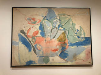
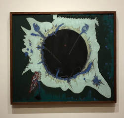 Paigan Void Barnett Newman 1946 oil on canvas Reflection: In PH-15, I really liked how vibrant it was. It was hard to identify the process used, but either way it was a cool result. I overall liked Mountains and Sea. I love how much color was used but in my piece, I would like to use more saturated and vibrant colors. It appeared to me that the paint was somewhat randomly applied to this piece and then the charcoal was added to accentuate different parts - of course this could be very wrong. I really really loved Paigan Void. I absolutely adore the colors and the overall look. I really like the layered affect and would defintley want to take inspiration from this piece. Overall, all of these pieces are very different. This has showed me what a wide range of art the term Abstract Expressionism covers. Play Page Inspiration
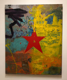
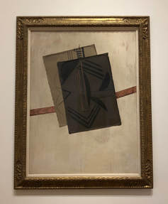
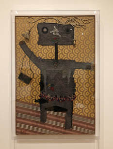 When I Was Young Enrico Baj 1951 collage on tapestry`` Reflection: Starting with Red Star, I really liked the layered look, however am not exactly attracted to the overall aesthetic. It also seemed like the artist used a lot of stenciling. This is something I would be interested in experimenting with later. I think When I Was Young is so funny. I like how it used extremely unexpected materials and is somewhat 3D. If I decided to try something like this I would have to work outside of my sketchbook. Lastly, I was drawn to Guitar because it related to my play pages and was really simple. It did not automatically click that this was by Picasso, but then it all started to make sense. These collages are all very different but all have characteristics that I want to incorporate in my play pages, like stenciling, 3-dimension, and some more simplicity.
A. Abstract vs. Non-Objective Abstract art begins with a subject from reality, whereas Non-Objective art includes no visual reference to reality. Although, they are different, it can be difficult to draw the line between the two. Sometimes it can help to look at the piece and see if you, the viewer, sees any things that resemble objects or figures from the real world. Here is what I believe to be abstract art: 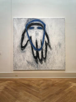 Blue Head Susan Rothenberg 1980-81 Acrylic and vinyl-based paint on canvas I think that this piece is abstract because, although it the outlines resemble a hand and head, they are abstracted, meaning there are altered away from reality. Here is what I believe to be non-objective art: 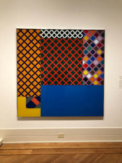 Untitled (yellow corner) Richard Roth 1971 Enamel paint on glass I think that this piece qualifies and non-objective because it does not directly reference or resemble any objects or figures from the real world. B. Abstract Expressionism Before I had always thought that abstract expressionism was just abstract art that was very distant from rendering a realistic form. After research, I know that Abstract Expressionism developed from abstraction in New York, in the 1940s and 1950s. It focuses on expressing emotions and the creative spontaneous act. Here is an example of what I believe to be Abstract expressionism: 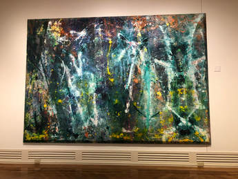 Born Again Sam Gilliam 1968 Magna and acrylic with aluminum powder on canvas I think this qualifies because it is definitely abstract, and conveys spontaneity and lots of movement. C. Mark-making  17th Stage Kenneth Noland 1964 Acrylic on canvas It seems like the marks in this piece were extremely careful, deliberate, and slow. The lines are very straight which surely took lots of concentration, unless something like tape was used.  Chasers: Purpled Sam Gilliam 1980 Acrylic on Canvas It seems like the marks made to create the texture of this piece were done very quickly and in a somewhat random manner. It seems like the texture was created with a serrated tool and all of the marks are going different directions, covering the piece.  Jungle Jim Lieberman Nicholas Krushenick 1969 Acrylic on canvas The marks in this piece are very repetitive, and seem very precise and deliberate. I would think the lines were drawn/painted using a ruler or some other tool. Depending on the tool used, the marks could have been made quickly or slowly, it just depends. D. Using art to answer questions about the artist 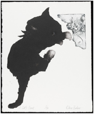 A Cat's Game Steven Fishman 21st century etching and aquatint (?) on wove paper Fishman used lots of contrast, color, value, and shape in this piece. The cat takes up a large amount of the piece and then there is a little drawing in the corner, putting emphasis on the large cat. It seems like the shape of the act may have originally been unintentional, like a spot made with ink. Maybe after this was done, the cat shape was enhanced and then emphasized with the little drawing (as contrast). This makes the artists eye look at the simple cat and then move to the detailed, small drawing. 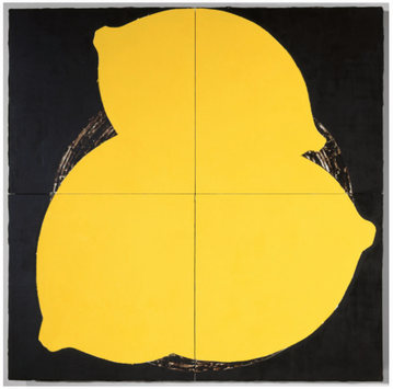 Lemons May 16 1984 Donald Sultan 1984 latex paint, plaster, butyl rubber, on vinyl tile over masonite In this piece, Sultan uses color, contrast, shape, and emphasis. I think that he started out with the black background and then added the lemons with the yellow latex paint. There is lots of contrast in the piece, possibly representing a meaning he was trying to convey. The color choices were clearly very intentional. Since the painting is so large, along with the lemons (the focal point), your eye is forced to look at the smaller details in between the lemons (in the background). 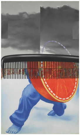 Early in the Morning James Rosenquist 1963 oil on canvas, plastic This piece shows the use of color, contrast, shape, and some overlay. It seems like he started by painting the background, then the paints and orange, and then the comb - this is just a guess. The color choices may have just been used for accuracy or to represent the differences between the objects. I think some of the choices made were just to add visual interest. The bright colors draw in the viewers eye, and then it is natural for viewer to next focus on the background and some of the less noticeable details. The composition of the piece is very interesting, the weight of the photo is mainly in the bottom half - this could be done to make the viewer's eye move up the piece. |
Archives
June 2021
Categories |
 RSS Feed
