Overall, I think this project went pretty well. I think that I captured my master's mark, but maybe did not include quite as much detail as Tiepolo did. I think that my self portrait is not completely accurate but captures the essence of the original picture, which is really what was important to me. I struggled to make decisions about where to put the different marks, so this is definitely something I could practice with. Eeek! This was so fun!
0 Comments
Abstract Expressionism
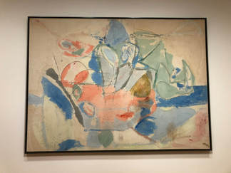
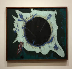 Paigan Void Barnett Newman 1946 oil on canvas Reflection: In PH-15, I really liked how vibrant it was. It was hard to identify the process used, but either way it was a cool result. I overall liked Mountains and Sea. I love how much color was used but in my piece, I would like to use more saturated and vibrant colors. It appeared to me that the paint was somewhat randomly applied to this piece and then the charcoal was added to accentuate different parts - of course this could be very wrong. I really really loved Paigan Void. I absolutely adore the colors and the overall look. I really like the layered affect and would defintley want to take inspiration from this piece. Overall, all of these pieces are very different. This has showed me what a wide range of art the term Abstract Expressionism covers. Play Page Inspiration
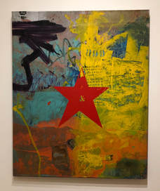
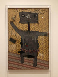 When I Was Young Enrico Baj 1951 collage on tapestry`` Reflection: Starting with Red Star, I really liked the layered look, however am not exactly attracted to the overall aesthetic. It also seemed like the artist used a lot of stenciling. This is something I would be interested in experimenting with later. I think When I Was Young is so funny. I like how it used extremely unexpected materials and is somewhat 3D. If I decided to try something like this I would have to work outside of my sketchbook. Lastly, I was drawn to Guitar because it related to my play pages and was really simple. It did not automatically click that this was by Picasso, but then it all started to make sense. These collages are all very different but all have characteristics that I want to incorporate in my play pages, like stenciling, 3-dimension, and some more simplicity.
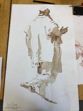
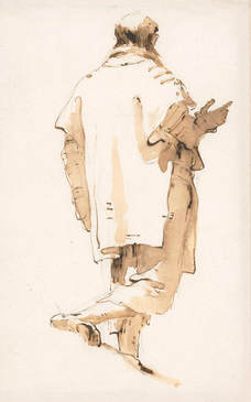
This is my self portrait after adding the dark lines with ink. I think this step really brought the piece and figure together, similarly to how it did with my old master's copy. I pretty much just placed the lines where I thought they would enhance the clarity, accuracy, and overall look of the work. I think this step was pretty successful and helped to connect my self portrait and old master's copy. 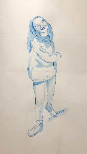 I do think that I lost a little bit of accuracy in the face with this step. Unfortunately, this would be very difficult to fix. Now, I just need to sign my piece and erase all of the pencil lines.
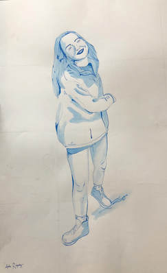
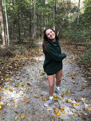
Here is my self portrait after I added the wash. I tried to approach this the exact same way I approached my old master's copy. This time around, it was a little harder because I actually had to decide where to place the wash. I mainly added it in the areas of the image with the darkest shadow but I also utilized some artistic freedom. 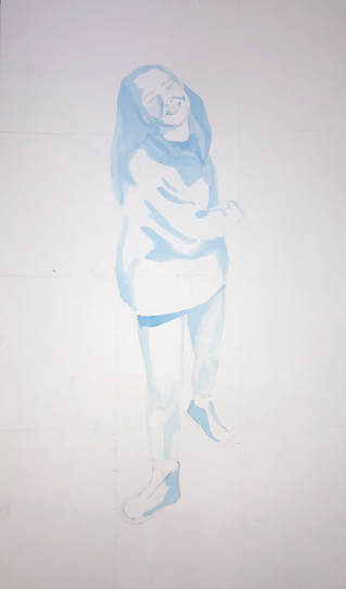 This is my self portrait after I refined the foundational drawing. I mainly just focused on improving the accuracy of the face and shoes. I think I was fairly successful in this. 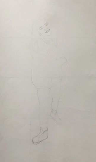 I know some of the lines are a little difficult to see, I tried to draw very lightly so I could easily erase mistakes.
This is my self portrait after the first week of working on it. I think it is going pretty smoothly so far. I still need to work on the shoes, which I was struggling with, and the face. I'm not sure why I drew the facial features so much darker than the rest of the body, but I will fix that later. Next, I'm going to refine the preliminary sketch and then add the wash. 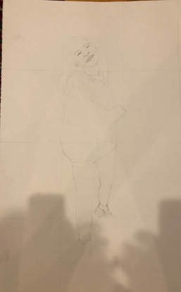 After seeing it again, the face definitely needs some work. Also sorry the picture isn't great quality - I'll upload a new one soon.
|
Archives
June 2021
Categories |
 RSS Feed
