|
I did not add anything else to my quarter one in class project, as it is complete, other than adding an element for hanging. Now, I have begun to plan for one of my quarter two projects. As of right now, I know I want to continue to incorporate circles and maybe experiment with using a spirograph. I also think I want to roughly continue to relate my work to the environment, but also will be open to change throughout the process. Here are my current ideas. 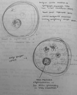 So basically, it would be a circle with spirograph designs all over and intricate hand drawn designs within those. There would then be a small circle that would be like an abstract representation of the earth. Lastly, there would be some type of colored transparent material covering the whole piece, except for the "earth".
0 Comments
I have not done too much work on my home project this week but here is the piece once I erased some of the elements I have not been happy with. I have also included some closeups of the drawing as the details are difficult to see in the overall images. 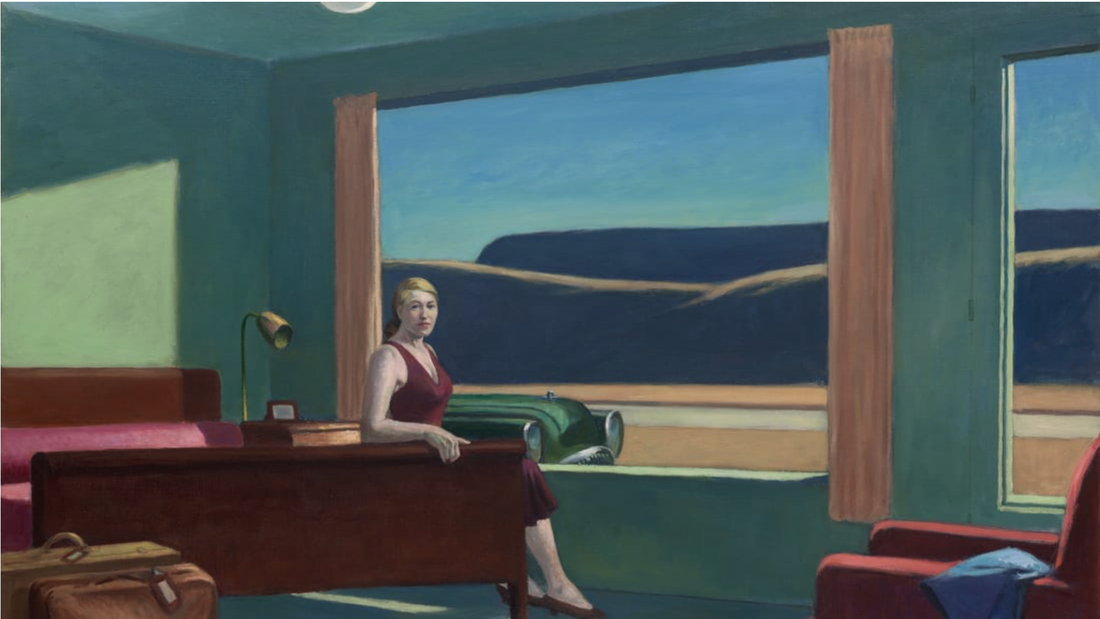 This past weekend I went to see the Edward Hopper and the American Hotel exhibition at the VMFA with my uncles, who really love art. I thoroughly enjoyed the exhibition but was honestly kind of surprised by it. Beforehand, I didn't know that the exhibition included more than just Hopper's work, what I had been expecting. All I knew about the exhibition was what I got from a quick look at an article in the newspaper. I had seen a picture of the real life set up of the painting above, Western Motel. I thought this was such a cool exhibit idea when I saw the picture, and was even more fascinated by it when I saw it real life. The real-life set up made the corresponding painting come to life. Also, since I was very familiar with Western Motel and the kind of tone I got from it, when I saw the set up it was kind of like the same feeling that I had seen in the feelings came over me. All of Hopper's pieces really interested me, as I just have so many questions. While looking at his pieces, I was continuously drawn to all the vertical lines within his composition. It wasn't that I didn't like this element, I just wonder the meaning behind it. I was also fascinated by the simplicity of the paintings, with a very complicated underlying tone. It's clear that there is deep content within and behind these paintings. I am not going to say that I in anyway fully understand this content, but the context provided by the other works in the exhibit, not by Hopper, really gave me a better grasp on it. All the other pieces related to hotels and motels and the history of them and what they can represent, supported and accompanied Hopper's pieces really nicely. Even though I hadn't been expecting this, the other works were much appreciated. Overall, I really enjoyed this exhibit, as I feel like I learned a lot about Hopper but also learned some history. I hope to learn more about Hopper in the future and get closer to answering some of the questions I have, such as
-is there meaning behind all of the vertical lines, not related to composition? -what really is the true meaning behind his work? -why did he stick with the subjects of hotels and motels for so much of his career?
Here is my in-class project finally complete. Since my last post I have added clear flowers onto the board. I did this by cutting out two sizes of flowers out of duralar, layering them, and then attaching them with push pins.
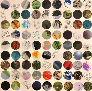
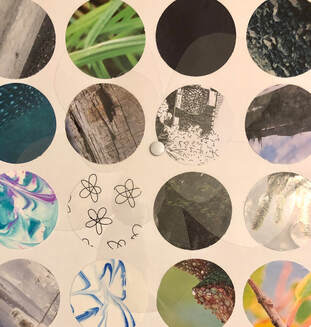
Overall. I am very happy with this piece. It turned out drastically different than what I had planned to make, but I am thankful for that. This piece is nothing like I have ever done before, it was really fun to play around with new techniques. Although the design and the components of the piece evolved over time, the content stayed pretty much the same. The sourced images of nature, intermixed with my personal drawings of nature allude to the changes in nature currently occurring, and how individuals are a part of that. The plastic flowers just kind of magnify this idea as they magnify some of the circles, while also adding another dimension to the piece making it come out at you, suggesting that you can make a difference too. I also like that the duralar has somewhat of a reflective element, also relating to this content. Throughout this project I didn't really face any specific difficulties, other than deciding what to do. I was overwhelmed with ideas throughout but am now happy with my decisions. I definitely plan on incorporating the same repetition of circles in my future pieces. 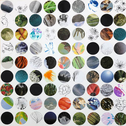 Here is my in class project so far. At this point, I have finished the background and planning on how I am going to finish the piece up. Already just the design for the background has changed so much since I originally planned the project. My ideas for the rest of it have evolved too. Originally, I planned on making a wire flower the size of the board that came out of it and then wilted back. I decided I no longer want to do that and have been playing around with some new ideas. I thought about maybe keeping the same concept but with smaller flower wires, incorporating spirographs, making origami flowers, and pouring resin over the whole piece, encasing dried flowers to keep the same idea of the wilting/dried flowers. I have finally decide that rather than making the piece more three dimensional, I am just go to add another layer for interest and emphasis. I am going to use the laser cutter to make about five flowers out of Dura-lar and then attach them onto the background. This still represents my original concept, but in a way that fits my ideal aesthetic.
I chose to look into Fiona Ross for this post because of my recent interest in the use of circles. For my current in class project, I am incorporating repeating circular cut outs, something I've never included or even thought to include in my work before. So far I have thoroughly enjoyed playing around with the use of this shape , and was shown a few of Fiona Ross's pieces for inspiration. I fell in love with many aspects of her work and wanted to know more about this artist and her work, and how that can all relate to me and my own work. website: https://fionarossart.com/home.html a few exhibitions:
CV Highlights:
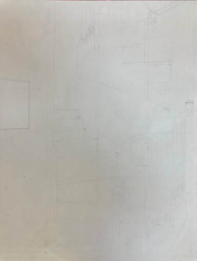
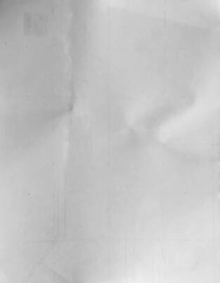
This ppersonal reactions to pieces: Fractal Eclipse #32: This was one of Fiona Ross' pieces that I was originally drawn to. The current piece I am working on reflects the repetition of circle within this piece. I love how this piece at first glance seems in a way simple visually, but is actually extremely intricate and detailed. I really like her use of negative space and overlap within this piece, two things I would like to experiment with in the future. Dislocation of a More Complete Pattern #61: When I see this piece I immediately and drawn to the delicacy. The level of craft is extremely high, with such intricate lines and use of color. Color is one of the main aspects of many of my pieces, but I have never thought to really overlap color or focus on how I can manipulate it, which I am now inspired to do. Complement of Closure #5: This piece is very compelling to me. I love the detail within the piece and how these details create depth. My favorite aspect of this piece is by far is the intersection of the faint lines and the bolder lines on the far right and left of this piece. This is honestly something I would have intentionally avoided in my own work, but is my favorite part of this piece....really makes me think I need to be taking more risks and exploring more opportunities. Float #2: I think this is probably my favorite piece of Fiona Ross' I have seen. One of the original reasons I was drawn to it was because it reminds me a lot of my uncle's art, but that's kind of irrelevant. I really like the use of earthy tones when creating a more free flowing, natural piece. The layering creates interest in the piece, encoding curiosity in the piece, it's like I just want to look closer and closer. short article: https://www.vmfa.museum/connect/fellowship-dollars-bought-painter-fiona-ross-more-than-just-materials/ This is just a short article the VMFA did on how Fiona Ross spent her fellowship money. I decide to include this to just show an example of how an artists kickstarted her career. I found it interesting that Ross used some of her money for travel, which just emphasized the importance of the inspiration behind art, something I look for more and more everyday. For my home project, I am working towards expanding my portfolio by creating an interior. I plan on doing this interior with conté crayon, but so far have just been working on figuring out what to draw, gridding, and the preliminary sketch. Here is a picture of what I am drawing and what I have so far. I am well aware that this looks like a blank sheet of paper. I promise there are light lines! I plan on completing a thorough preliminary sketch this weekend, focusing on the accuracy of all the angles.
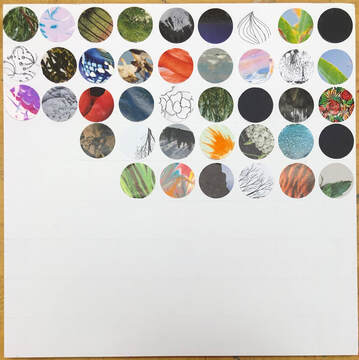
For my in-class project I am making a sculpture that can be hung on the wall. The piece focuses on nature, climate change, and how an individual can make a difference. I am not too far along on this piece since I missed a few days and kept changing my ideas, but I have finally landed on my definite plan. The base of the piece, what will lay flat on the wall, will be made out of foam board and be covered in gridded circles. These circles will be made out of images of nature from magazines, construction paper, tissue paper, and my own doodles of nature. On this square piece of board, will be a wire flower. The outermost and innermost of the flower's pedals will attached to the board while the rest will be off of it, making the piece three dimensional. The flower "coming at the viewer" relates to the content of how an individual can make a change. Also, in the center of the flower will be bundled up text relating to the content just mentioned. Here are my plans! What I have so far are all of the images and paper that will be cut into circles, but I cannot upload pictures of all 81 of these. 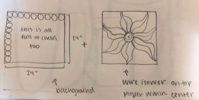 |
Archives
June 2021
Categories |
 RSS Feed
