8 Comments
Helen Hall
3/30/2020 09:27:13 am
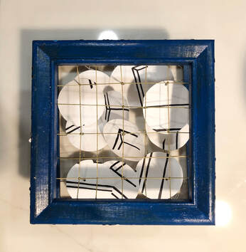
This piece really reminds me of that one show we saw at the VMFA with the grids. I like how you are experimenting with perspective and I think you should try to do one where the circles line up to make the interior through the altered perspective (if that makes any sense). I like the circles on the side, but I also think the solid color on the front of the frames doesn't distract from the inside circles which I think are meant to be the main focus. If the frame is meant to be more influential on the piece, maybe think about drawing perspective lines on the frame itself? could be cool. What would you say the content of the piece is? I think the craftsmanship is good, especially how clean the grid is and the circles themselves as well. How were you thinking of displaying it? Overall, really well done and I think you should definitely continue with exploring this idea!!
Elizabeth Celentano
3/30/2020 10:28:26 am
This experimentation is so cool! I agree with Helen that you should try to line up the circles to make the interior through the altered perspectives. I also like how the colored circles are only on the sides of the frames. I would recommend exhibiting the piece at an angle so that you can see it from both the side and the front. I'm excited to see where you will go next! Maybe you can find a way to synthesize this artwork with your previous ones concerning environmental concerns
Amelia Seabury
3/30/2020 09:57:24 am
I love the dimension and fragmentation you created using the stacked frames! I noticed that Helen already said this, but I almost expected the image to line up from a certain perspective and I think it would be interesting if you experimented with that in the future. On the other hand though, you could present the idea that people expect things to line up perfectly but sometimes life simply doesn’t. I don’t think you need to add the dots on the front of the frame unless it adds to content (also the color of the frames is just sooo pretty).
Rylan Karjane
3/30/2020 12:35:43 pm
I am in love with your piece. I love the color palette, and the rustic feel of the brown string and the texture of the frame. I personally don't think you should at the circles to the front of the frame, I feel like it would be cleaner and of higher quality if you don't add them to the front, but if it is super important to your content, it would still be cool. I also definitely think you should line up the interior circles so that we can see your cool perspective drawings. Overall I think that this was a great piece.
shreya malani
3/30/2020 01:12:43 pm
I really love this piece and I think it’s an interesting combination of all your past pieces since you often have cut out circles and some sort of grid like pattern involved. I really love the colors of the frame and I don’t think that you should put the circles on the front because I think that the solid blue allows the viewer to focus more on the circles which I think is the main part of your piece. As Amelia said, I think that it would be really interesting to have all the interior drawings line up to create an actual image but I also like the ambiguity of it all. Great job ;)
Julianne Zielinski
3/30/2020 02:26:45 pm
I read the other comments, and I know most people are saying to not add the small colored circles on the front but I kind of really liked how it looked and I thought having them on the front would be pretty. However, I think the aesthetics of the piece how it is now are really pretty and I love the piece you made. I think its a cool combination of your current style and the style of the sculpture you made last year with the birds and your book piece. I think the way the circles are organized now looks amazing and I feel like if they were put together to form a coherent image the piece would lose some meaning. I love the creativity of this piece and I think its an amazing addition to your portfolio. Epic job! ((:
Ria Bakshi
3/31/2020 12:59:41 pm
I really like how the front of the piece looks! I would say it would be cool if there was more order when looking at it from the side, t because I think it would be a really cool addition if you looked at it from a different perspective and its appearance changed, which can give the piece more content too. I love how you're slowly moving to more sculpture type pieces, it looks really good!! 4/1/2020 07:00:33 am
!!! Leave a Reply. |
Archives
June 2021
Categories |
 RSS Feed
